MamoPay App

2022

TimelineAug 2022 - Oct 2022 (2 months)

TeamDaniel Obiekwe (UX), MamoPay Team

RolesUX Research, Visual Design, Prototyping, Usability Studies

TimelineAug 2022 - Oct 2022 (2 months)

TeamDaniel Obiekwe (UX), MamoPay Team

RolesUX Research, Visual Design, Prototyping, Usability Studies

Project Overview

MAMO PAY is an app making money transfers within the UAE instant. With Mamo Pay, you can split the bill, share the cab fare or pay for that yoga class with just an email or phone number. Sending money with Mamo Pay is designed to be effortless, secure, and instant.

Whats the problem are we trying to solve here?

Sending money to close contacts can be problematic for both individuals and businesses, with the high fees and slow systems offered by your typical banking systems in UAE.

Mamo tries to solve this problem and makes transfer of funds not just seamless, secure and affordable for individuals, but for businesses aswell.

Design Process

The first step of my design process involved user interviews and competitive research to understand how competitors and users behave. I believe it’s important to get this information early on in the process, before having an idea or prototyping. ‍

After analysing this insights, I began to conceptualize the solution, focusing on user flows, sketches and wireframes to give me a way to iterate faster through ideas. From this, I went to the visual design, conceptualizing the user interface while considering design principles such as contrast, hierarchy and feedback, brand attributes and user interactions as it will be in the final product. ‍

Once the interface was ready, I took feedback from other project stakeholders in order to understand the experience gaps. User validation, although part of my usual design process, would be a post-conceptualization and won’t be discussed in depth in this case.

persona detailspersona details

Defining the Challenge

I conducted user research and interviews to understand the users I’m designing for and their needs. I identified through my results, following challenges that needed to be addressed.

  • Usability

    The application needed to be easy to use and communicate clearly and confidently all the features without any unnecessary hassles

  • Affordable

    Because of the outrageous rates set by traditional banks, financial technologies like MamoPay need to also consider affordability

  • Secure

    MamoPay needs to provide a secure means for transactions to take place considering that it involves movement of peoples finances across networks

Research & Analysis

Competitive Analysis

I started the project by analyzing the competitors’ weaknesses so that I could define those problems as a starting point. This helped to discover additional features which could improve the overall marketability of the solution to end users.

Competitive Analysis on MamoPay App

User Personas —

I held nine interviews with customers in the UAE to obtain in-depth qualitative responses regarding the key aspects of their experience with e-wallet / payment apps.

Rashid Ammar's persona avatar for MamoPay App
Rashid Ammar
Zara Odhiambo's persona avatar for MamoPay App
Zara Odhiambo

User Journey

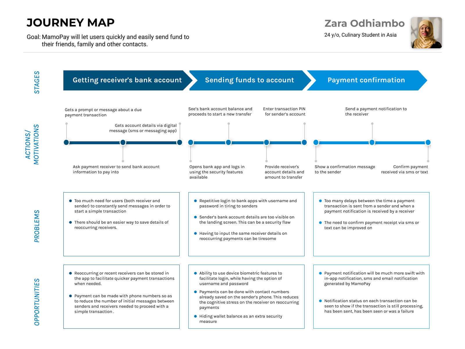
Mapping Zara’s user journey revealed how helpful it would be for users to use contact information (phone number or email) to facilitate transactions and how best to secure payment transactions with passcodes and biometric data.

User Journey Analysis on MamoPay App

User Research Summary

After compiling the competitive analysis and extensive research through user stories and user journeys on personas, defining problem statements, documenting and analyzing key pinpoints and insights gotten from user interviews; below are the summary key points to focus design on.

Key Pain Points
  • Sometimes I don’t need to load and transfer funds which can be easier with a wallet system
  • I need a system that makes it easier for me to pay for services and receive payment for friends and family
  • Having to put in my password all the time can be tiring, however I don’t want people to just have access to my money because the have access to my phone
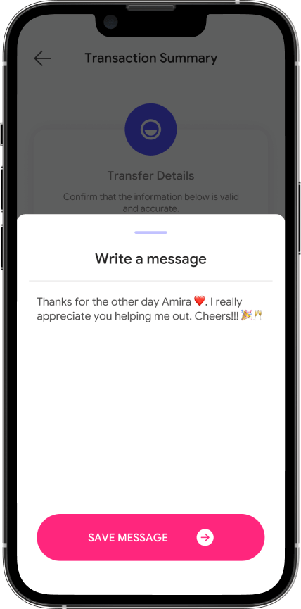
  • I need to be able to add special notes like birthday wishes when I send a gift (money) to my friends
Key Insights
  • 01

    Users want a secure experience on MamoPay where they can trust their money is safe for transfer

  • 02

    Users want a wallet system so they can also save money on the MamoPay app

  • 03

    Users want to be able to give heart felt messages when they send money to their friends.

The Design Goal

I created empathy maps to understand the users I’m designing for and their needs. A primary user group identified through research, with the following chart

App User

Trustworthy
Easy to use

Secure transactions
Visual rebrand

Product

High marketability
Customer retention

Business

Ideating a Solution

User Flows

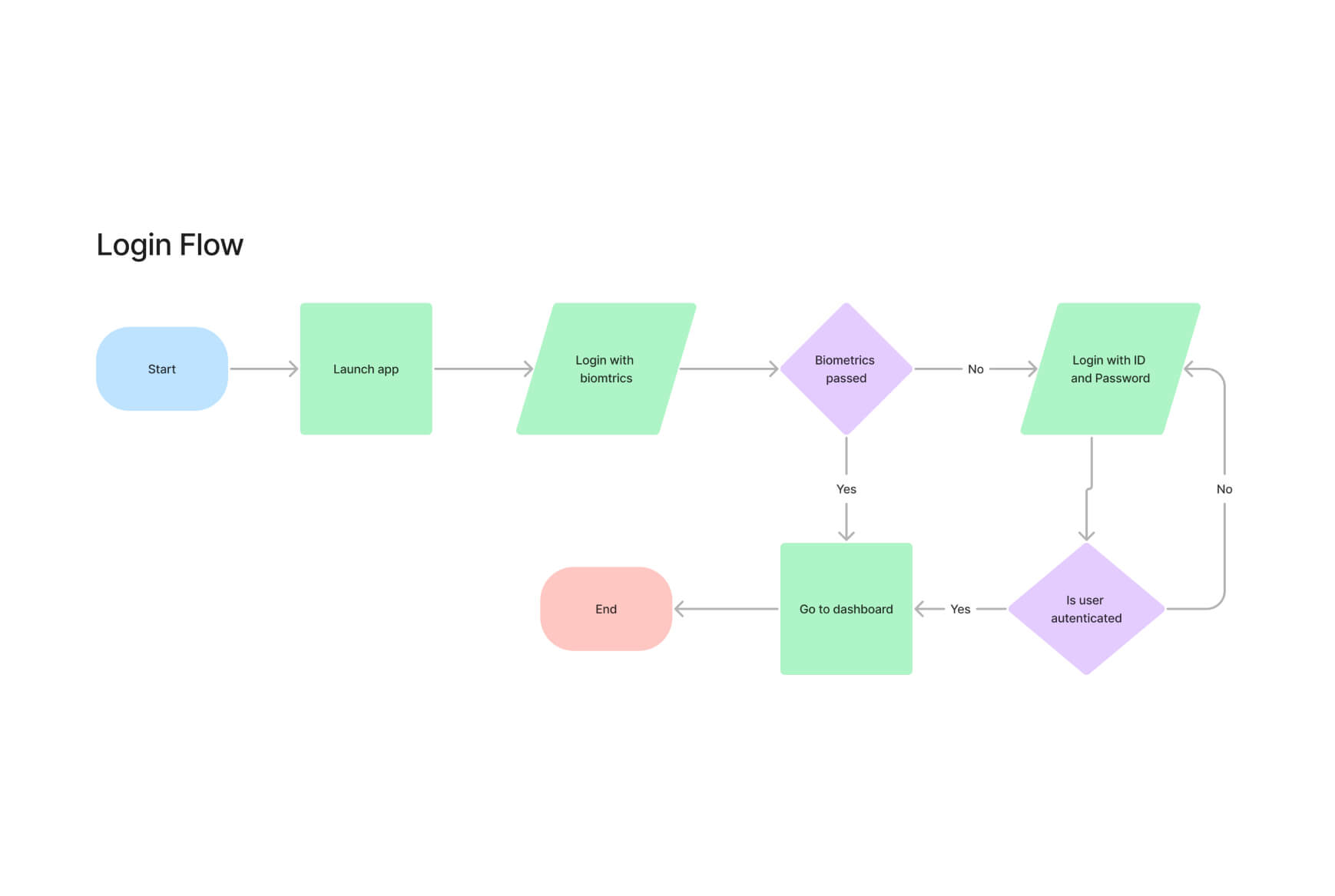
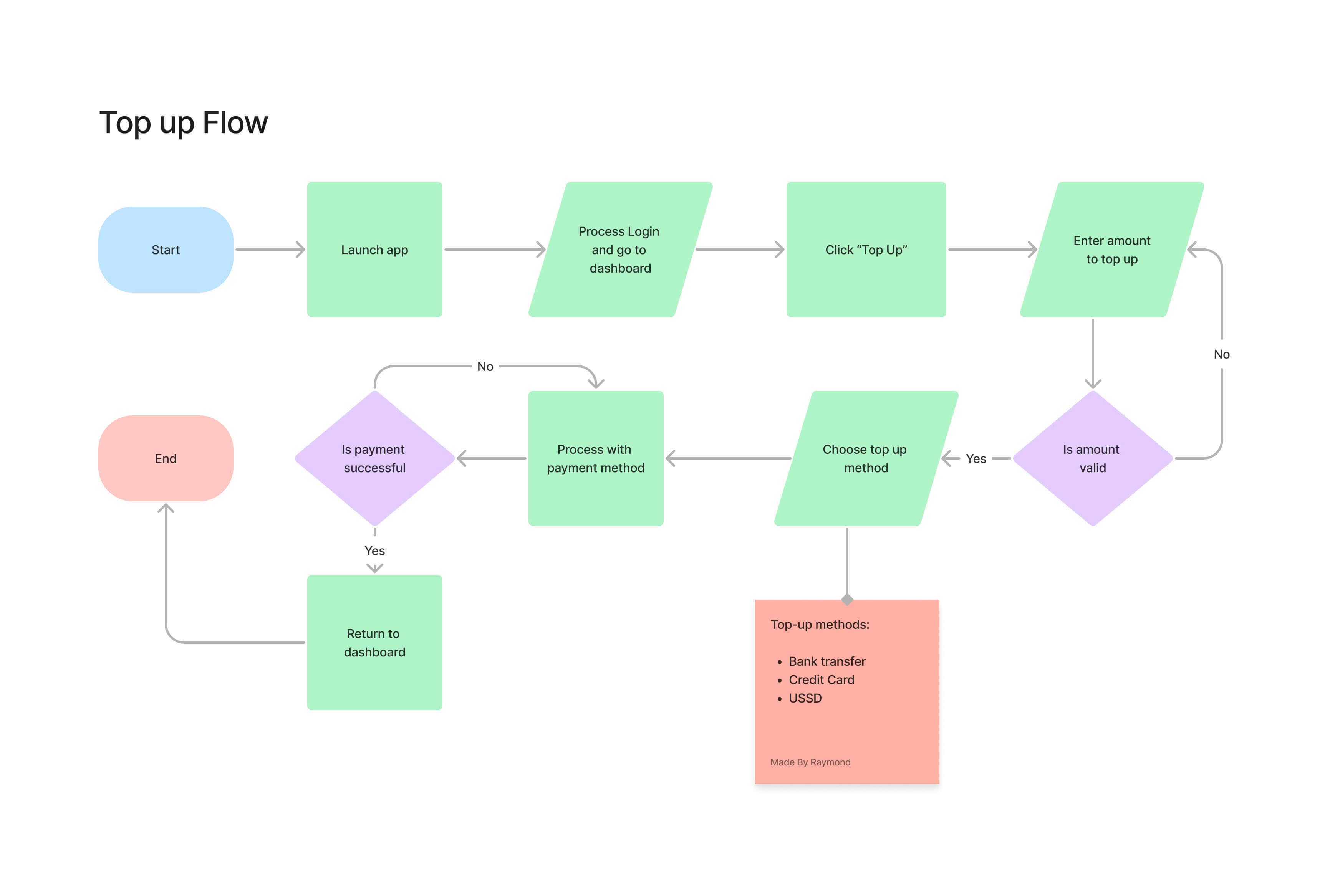
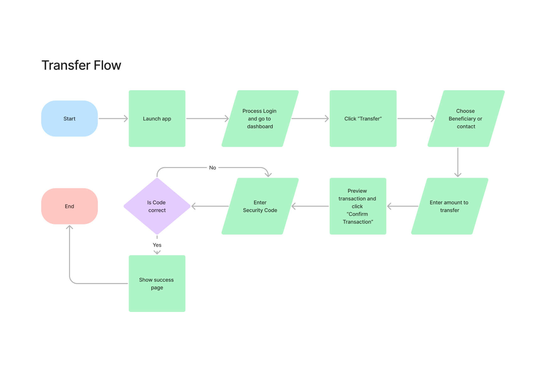
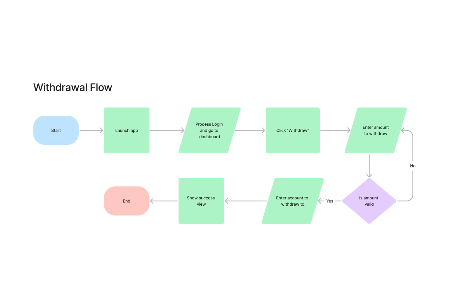
The overall user flow is separated into 4 stages: user login flow, wallet top up flow, funds transfer and funds withdrawal flows respectively.

01 –– From app launch, user can log in using password credentials or biometric pass.
02 –– Users will be able to see their e-wallet balance and top up if needed from their bank.
03 –– Funds in their wallets can be transferred to other MamoPay users (and later on directly to bank accounts).
04 –– Withdrawals are done directly to specified bank accounts.

For the last three features, I used the UX flow of numerous fintech services as a reference.

Flow for Project — MamoPay App

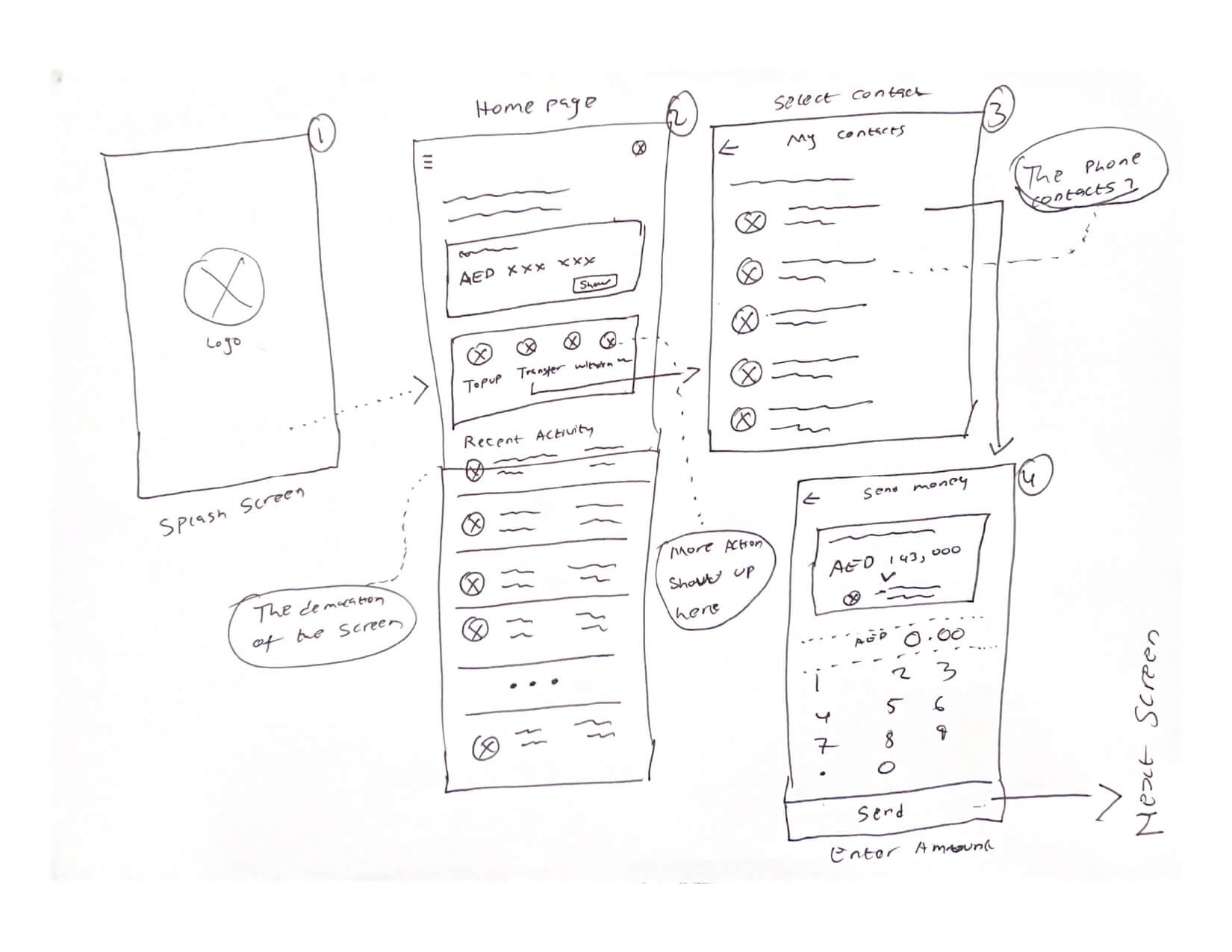
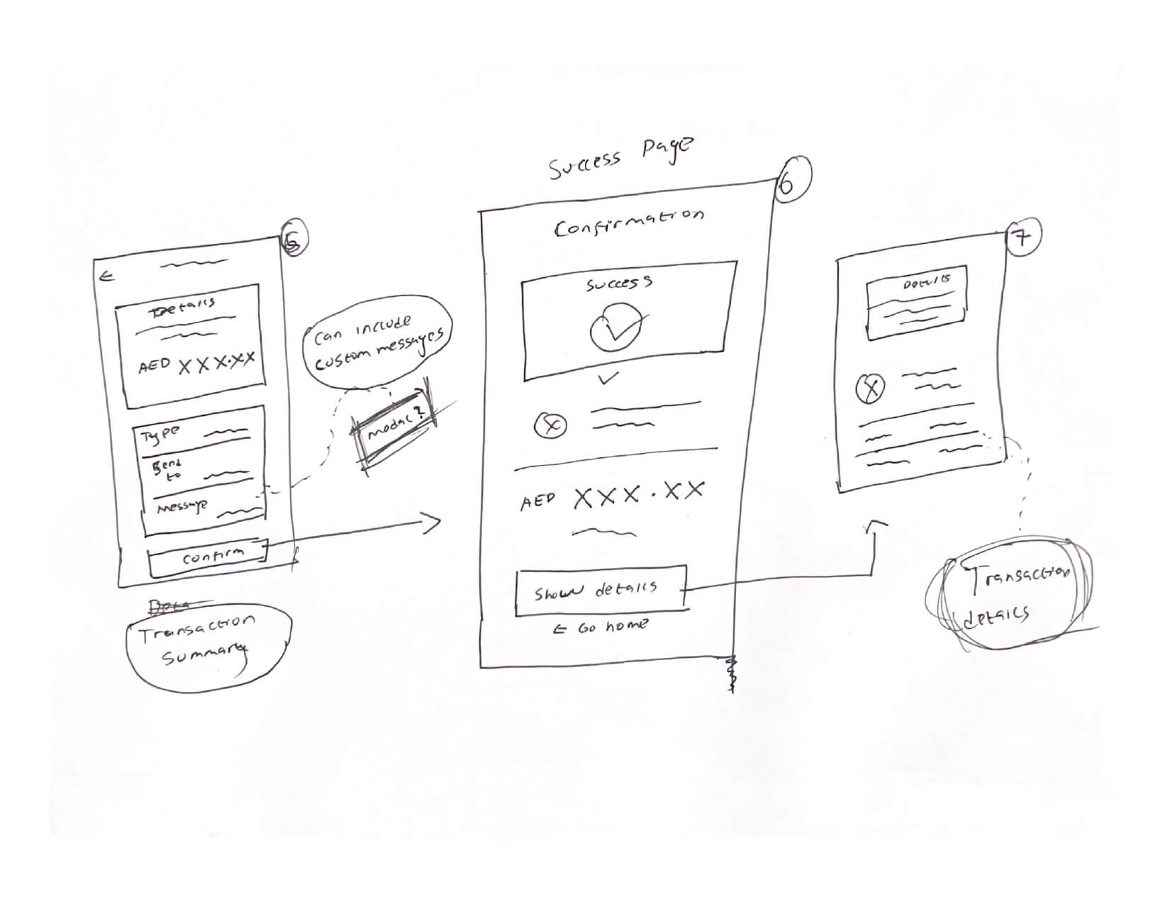
Developing Sketches

After talking to internal experts in UAE, I got a better understanding of how to understand the user insights. From this, I continued ideation and developed some sketches to more concrete concepts.

Sketches for Project — MamoPay App

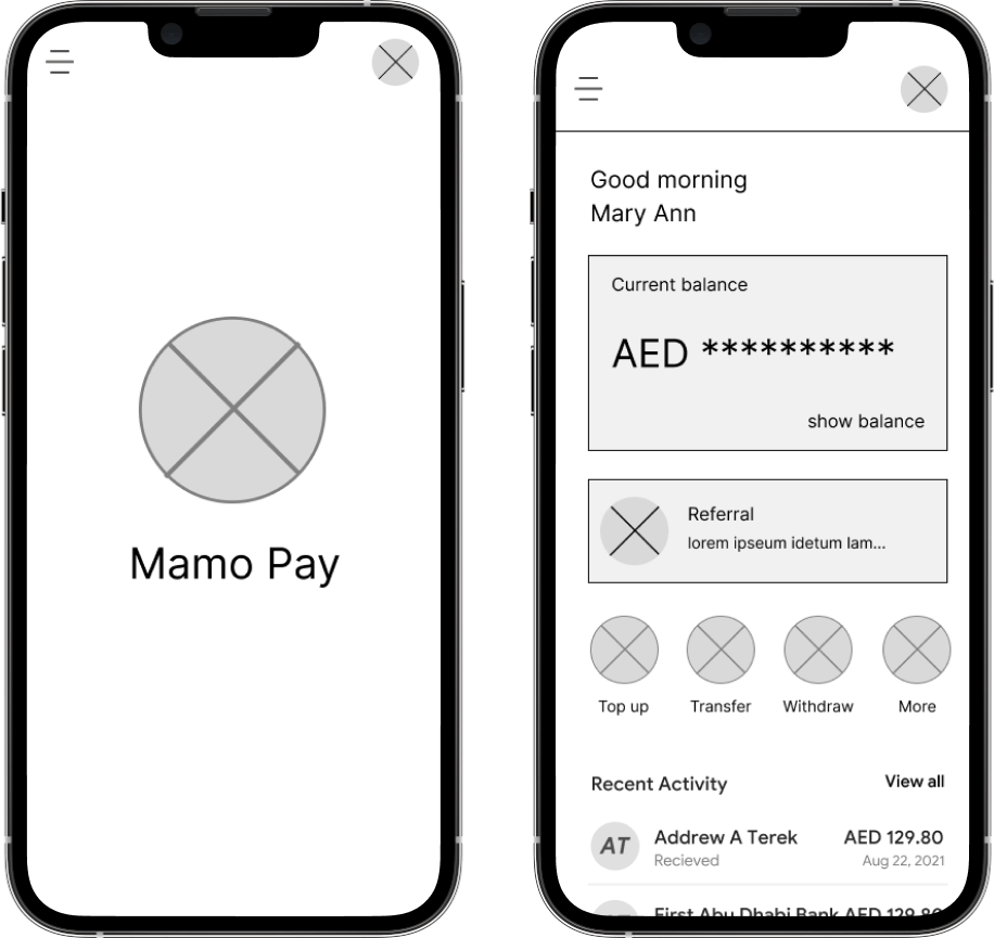
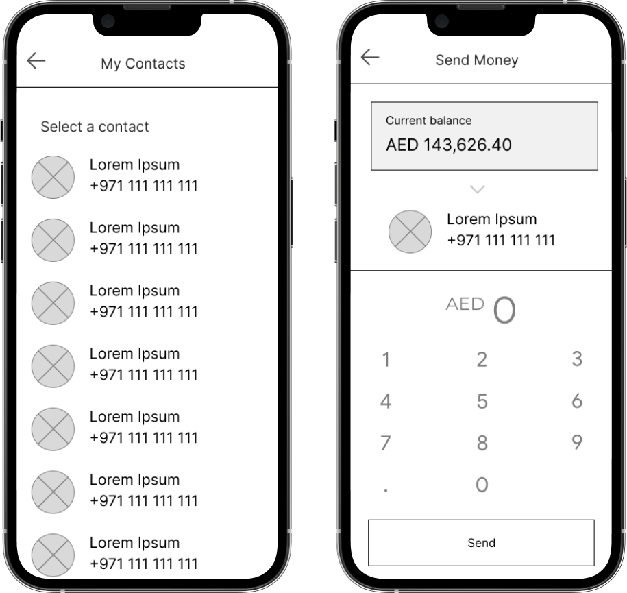
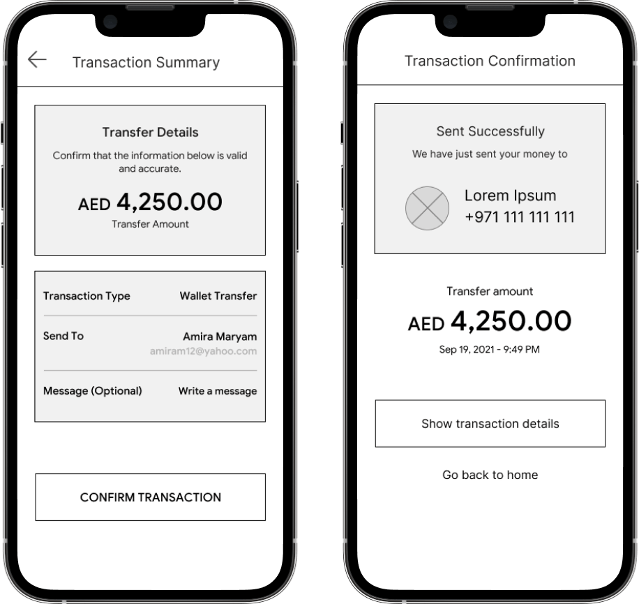
Wireframing

Wireframes were made to start developing the structure and functionality of the application and defining the sizes, margins and overall information architecture. After presenting them internally, questions arose if the customers need to have multiple top up methods and the complexity it adds to the application and overall development time.

We concluded on leaving the users with at least 3 methods for them to choose from. The wireframes also helped to define which version of certain screens were preferred.

Wireframe for Project — MamoPay App

Usability Studies :: Findings

I conducted two rounds of usability studies. Findings from the studies helped guide the designs from wireframes to mockups. It also revealed what aspects of the mockups needed refining.

  • 1

    Users didn't know where to find recent transactions

  • 2

    Users enjoyed the ability to hide and show balance

  • 3

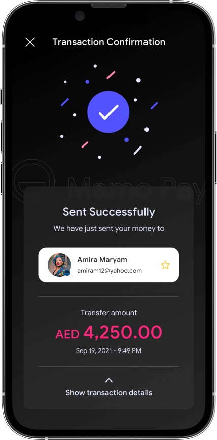
    Users wanted to see the transaction details after completing a transaction

Reflections from Ideation

Insights

  • The app needed to account for linking more than one bank account for withdrawals
  • Including 3 payment methods for users to choose from when funding their e-wallet
  • Transfer of funds from the e-wallet should also account for user not on the platform
  • A referral feature will be a good marketing strategy to adopt in the early stage

Key Takeaways

  • Linking more than 1 bank account will be an incremental update post-launch
  • Transferring funds directly to bank accounts of friends or other users will bring added complexity to the app and due to the time constraint on the project will be added as a feature update

The Design Solution

Visual UI Design

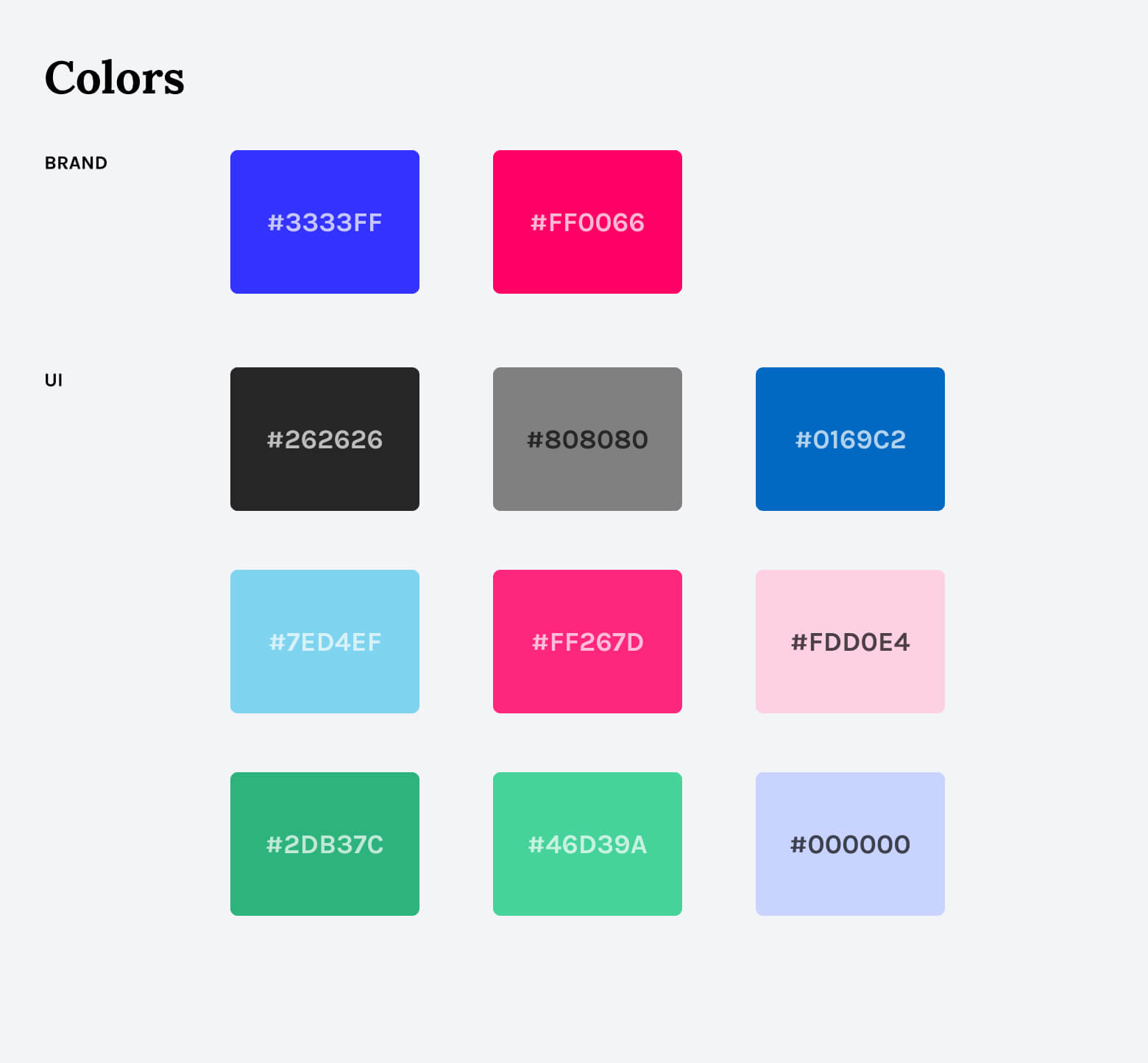
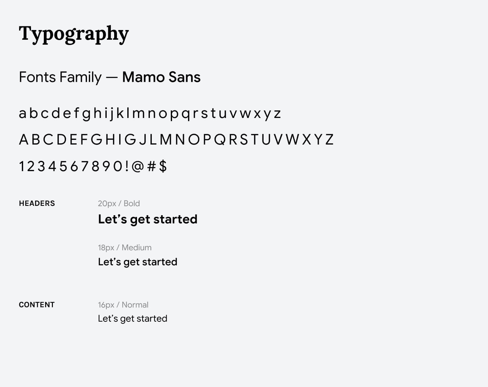
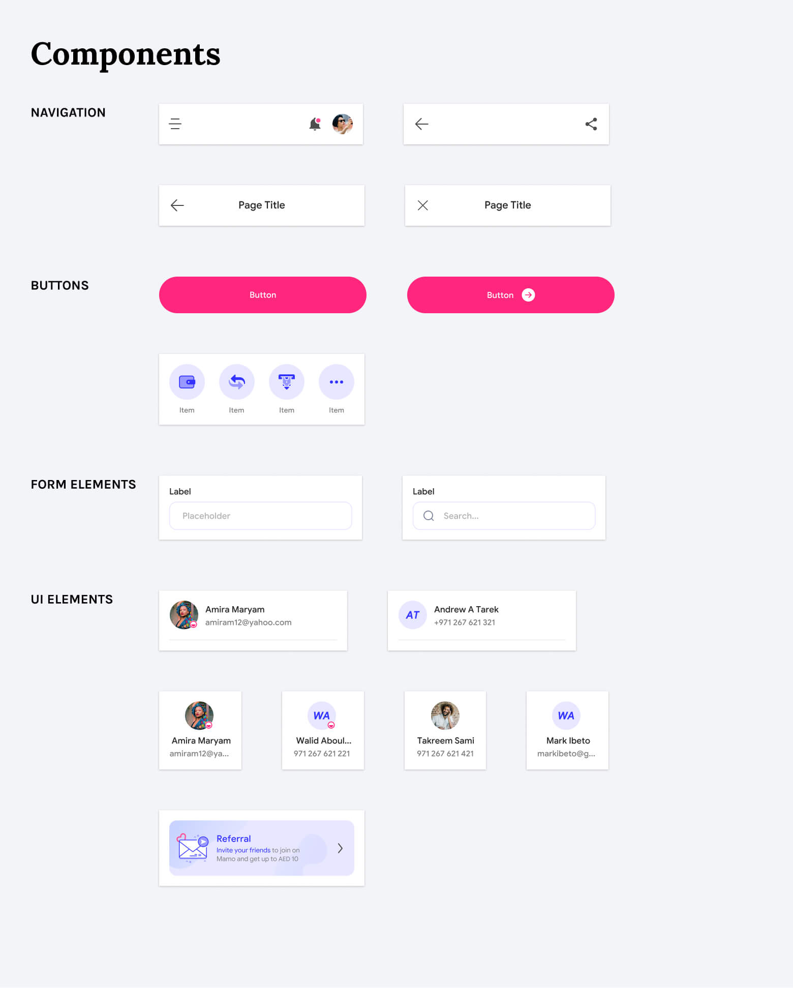
Design System — Foundations & Components

As there was no visual identity of the project yet, I started from scratch. Based on several brand keywords form the client, I developed a style guide that can be used to align all visual elements of the project.

Typography, colors and styles are the visual building blocks used in the application.

Visual Design for Project — MamoPay App

Key Features
The overall key features of the application which are the security features for safe and secure money transfer, the withdrawal and the top up features for a quick and easy to use experience.

01
Wallet Top up

Users can top up their wallets and store money there till they are ready to use it for a transaction

Wallet Top up
Transfer to Beneficiaries
02
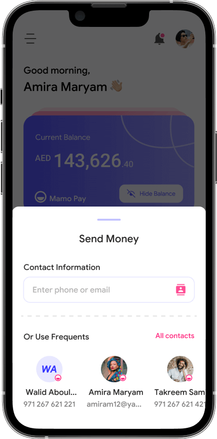
Transfer to Beneficiaries

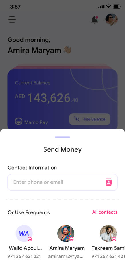
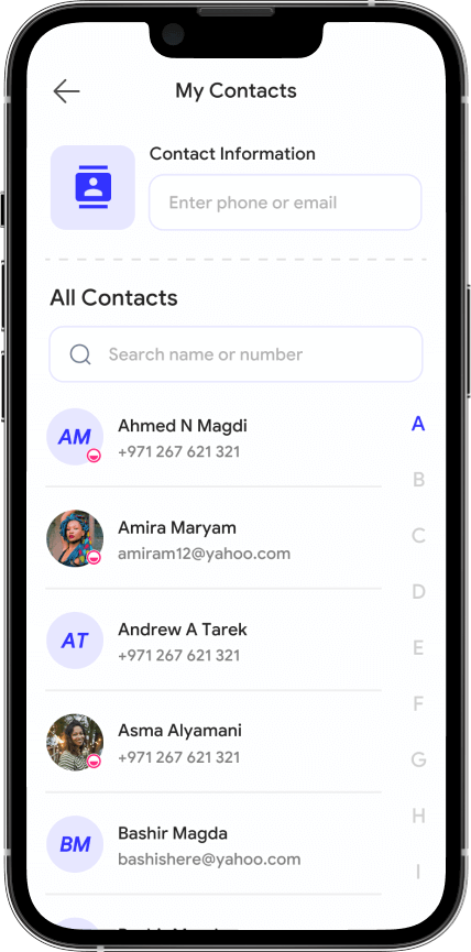
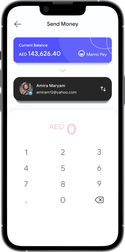
Transfers can be made to phone contacts that have the app, stored beneficiaries or by putting in the user's email

03
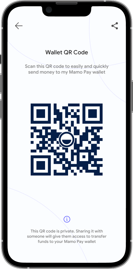
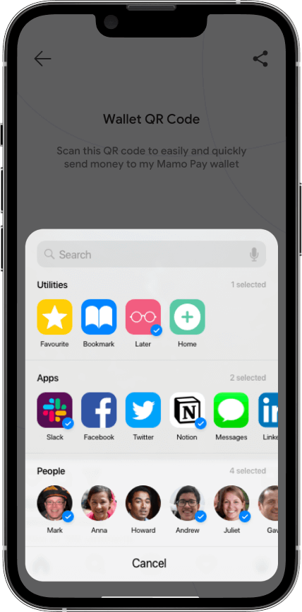
Secure QR Code

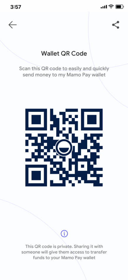
Every wallet has a secure QR code that the can use to make transactions much more seamless.

Secure QR Code

UI Designs —

Splash Screen
Splash Screen
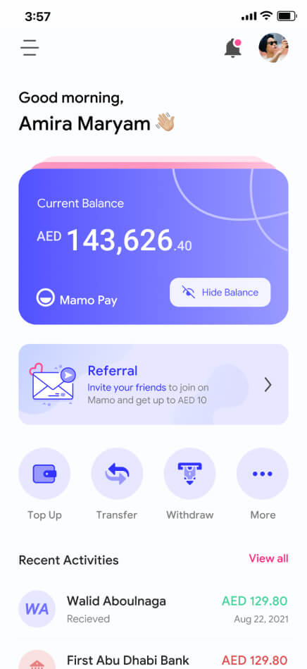
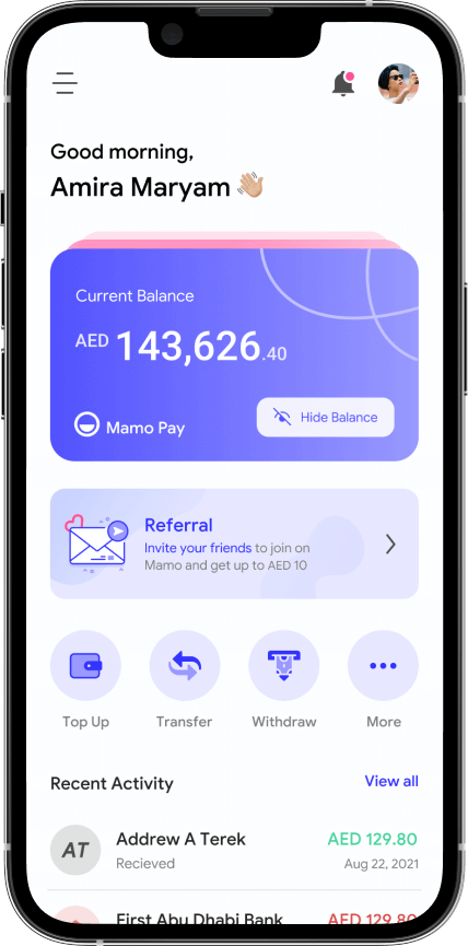
Wallet dashboard
Wallet dashboard
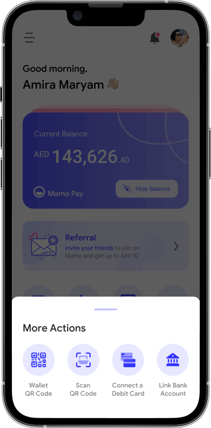
More actions tab
More actions tab
Wallet Secure QR
Wallet Secure QR
Share QR Code
Share QR Code
Send to beneficiary
Send to beneficiary
Choose contact
Choose contact
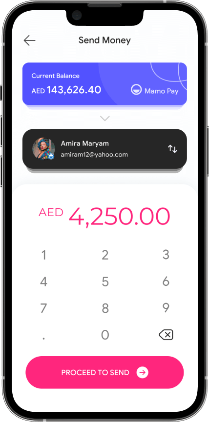
Send money - 1
Send money - 1
Send money - 2
Send money - 2
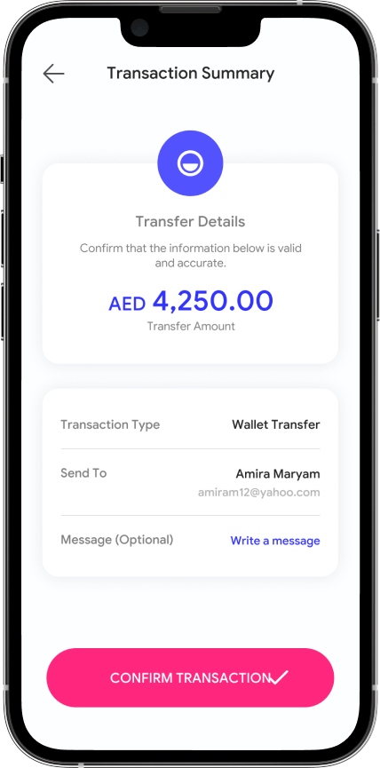
Transaction Summary - 1
Add notes
Add notes
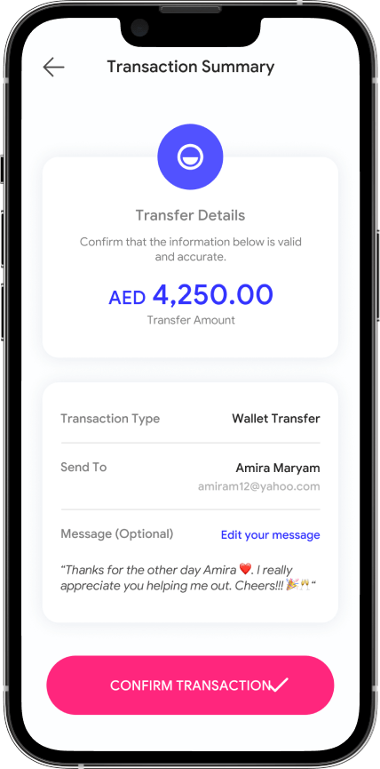
Transaction Summary - 2
Transaction Success
Transaction Success

Reflections from Visual Design

Insights

  • Used colors that conformed to WebAIM standards as an accessibility consideration
  • Include consistent icons to help make navigation easier throughout the app
  • Account for users who are vision impaired using screen readers with bolder more readable text fonts

Key Takeaways

  • Constraint on time to begin development was a major challenge in this phase
  • Transferring funds directly to bank accounts of friends or other users will bring added complexity to the app and due to the time constraint on the project will be added as a feature update (reoccurring takeaway)

Conclusion

In summary, the app makes users feel like MamoPay really thinks about how to meet their needs. Solving the problems of making the transfer of funds not just seamless, secure and affordable for individuals, but for businesses aswell.

One quote from peer feedback:"I love that there is a space to gift funds. It will be an amazing feature for my loved ones"

Learnings & Impact

  • While designing the app, I challenged myself with a product that affects users from diverse groups, keeping in mind how the app can be used as both a small business tool and personally, making the app's experience excellent for all user groups.

Next steps

  • Conduct more user research to determine any new areas of improvement
  • Conduct another round of usability studies to validate whether the pain points users experienced have been effectively addressed
  • Improve on the overall UI Design of the application in terms of colors and fonts. Test if this conforms to WebAIM standards